Representational Reflection Post
|
|
Reflection |
Final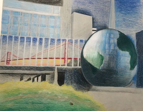
|
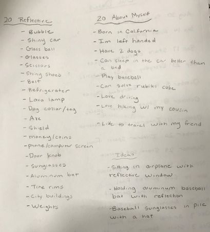
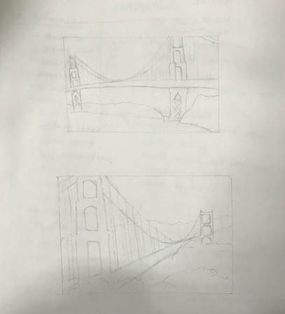
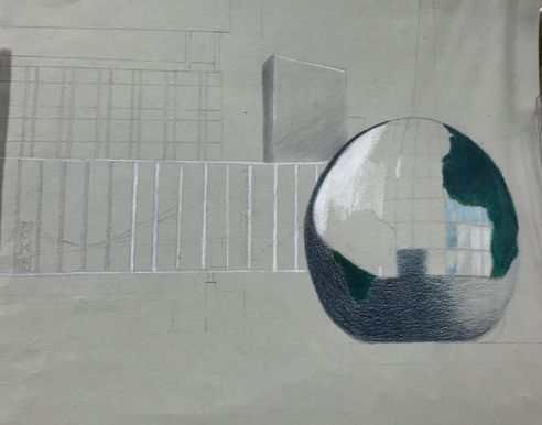
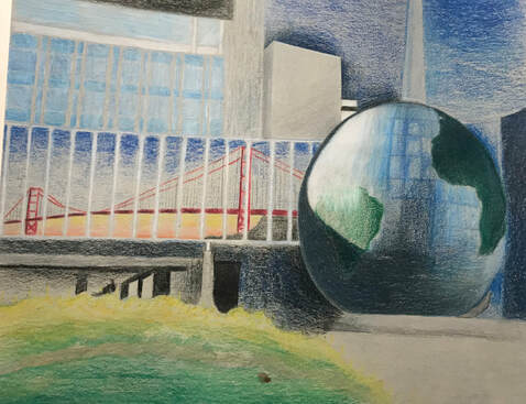
For this project we were to create a drawing of something with a reflection in it and the artwork would reflect on us. I came about this idea by finding a reflection on me, which is California. I drew a picture of the Raleigh Science Museum, because I currently live in North Carolina. Then I drew a reflection of the Golden Gate Bridge in the glass walkway because I am from California. This way I could incorporate one reflection into an actual reflection. To create this piece of art, I used prisma colored pencils. It was pretty hard for me to create globe with all of the little panels on it because of the different shades throughout the surface of the globe. I definitely could have used way more detail on the landscape and buildings of this piece. I also could have done a lot more layering so that I would have a much smoother blend to the colors. If I worked with plants/flowers more, I would have been able to make that portion of the piece look super good. Next project I work on I will be sure to add much more detail to it. This project just made my knowledge greater on how prisma colors work and what I can do differently next time to improve.
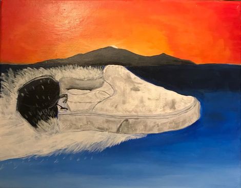
Everyday Object Post
|
Final Artwork
|
Reflection
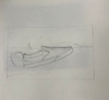
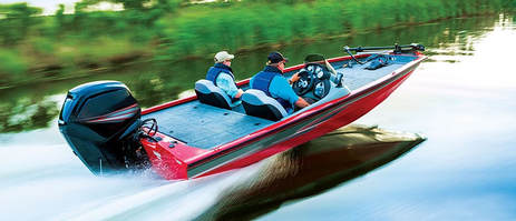
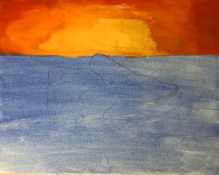
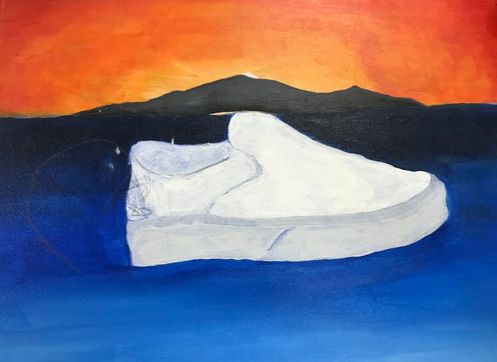
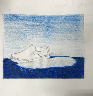
For this project I really wanted to do something different. The whole point was to take an everyday object and put it in a different environment than it is usually in. I chose I white slip on van shoe because those are the type of shoes I usually wear to school. They are everyday to me. I chose to turn it into a motor boat well... because it is different, and also because the vans are shaped into a somewhat similar shape to a motor boat. I also really wanted to work on painting water because I am not really used to painting in general and I would like to become better at it and enhance my skills. I feel like I definitely could have added some waves and a bit more texture to the water. That would have made this painting much more realistic and make the painting more "complete." I also think that I should have added more detail to the motor so that it didn't look like a big black blob. The shots of water coming from the shoe and motor I feel look pretty realistic and I have never done a texture in water like that before. Other than that I think the piece turned out pretty good and I still have a lot of space for growth to get better.
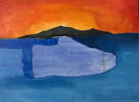
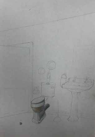
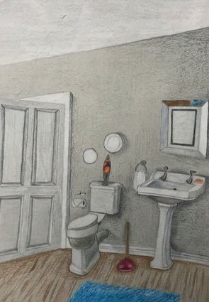
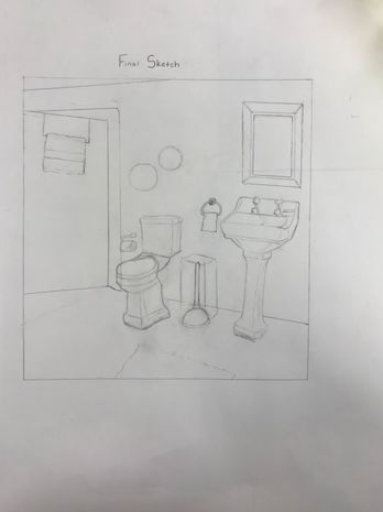
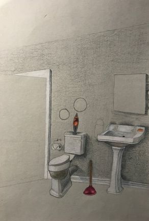
Interior Design Post
|
Final Work
|
|
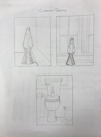
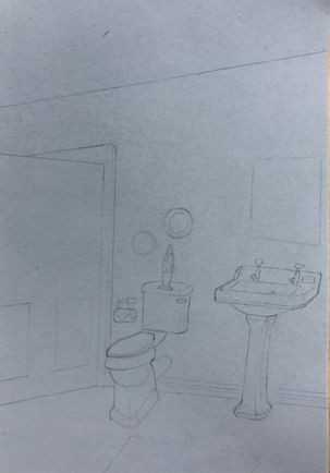
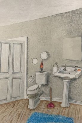
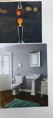
For this project I wanted to do a simple bathroom but add a couple unique features to it. I wanted to draw a bathroom because it was what came into my mind when i thought of an interior space. I drew a lava lamp on top of the toilet because i felt that it was just a little detail that other pieces wouldn't have. I also wanted to add a plunger to take up some of that open space.
When drawing this piece the hardest part for me was getting the correct proportions. You need to make sure that one object isn't protruding out more than the other and make sure that all of the angles lines up. I think that I did ok with it, but there is definitely room for improvement. I feel that i could have done much better with the wooden floors and should have added more detail. I also could have smoothed out the shadows in the walls and on the door.
Completing this project really shows me what i need to work on and teaches me that drawing interior spaces definitely isn't as easy as it seems. I think that with more practice with techniques and adding more detailed/accurate lines i can show some major improvement to my interior space drawings.
|
|
|
|
|
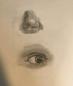
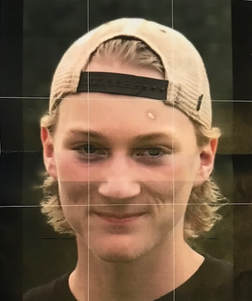
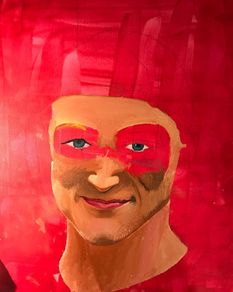
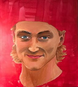
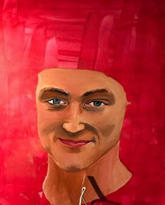
I feel like the picture of me that I used was a good challenge when painting a self portrait. The picture had a lot of shadows and values throughout my face. This is my first painting done in oil paint so I was learning as I created the piece. I really like how oil paint blends and that helped me when incorporating all of the different colors into my face to really create that skin tone that I wanted. It was pretty difficult to blend the lighting of my nose in with my cheeks because of the dark shadows near it. It was also hard to get the right texture for my hair because I feel like my hair color is too close to the color of my skins that I used. The things I do like about the portrait is I think I did pretty good with the eyes and the color of them. I also think that the shading on my jaw and chin look decent. Using oil paint to paint myself was very eye opening for me because I used to hate oil paint, but as I used it the medium is starting to grow on me.
|
|
|
|
|
|
|
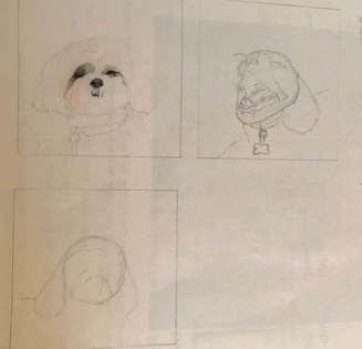
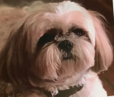
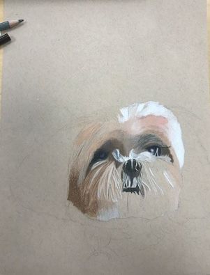
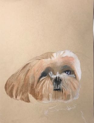
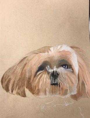
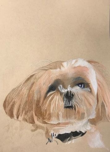
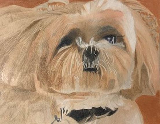
When choosing what to draw for my animal portrait, it wasn't very hard to choose my dog because I've had him for a long time and I really haven't done a completely colored drawing of him before. I chose to do colored pencil because that is the medium I am most comfortable doing and I have much more experience with them. It was a bit of a challenge drawing Levi because his fur isn't in slim strands and most of his fur color is close to the same tone. I enjoyed doing the eyes, mouth and nose, but doing the rest of his head was hard for some reason. In the picture the colors are kind of blended like a blur and that was tough to recreate. I feel that if I added more layers that it would have turned out much smoother and realistic. I do like how I did the white hairs near his nose and mouth, I also think that I blended the top of his head decently well. I have learned a lot from this piece and I will know what to fix for when I draw another animal with prisma colors.
|
|
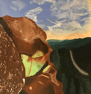
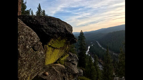
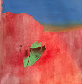
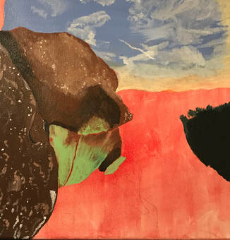
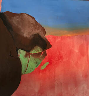
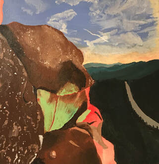
This is a picture that I took when I went to California and went on a hike with my cousin at Lake Tahoe. I wanted to paint this photo because I love the perspective and the colors in the rock. I chose to paint this landscape in acrylic just to switch it up and get more skilled in this medium. I really think that i could have had more detail in the rock that is on the far left side, to me it doesn't look as realistic as the rest of the rocks. I probably should have put more value in it and added shading to create that realistic texture. On the other hand, I like how the sky and the trees turned out in the final piece. Maybe i could put different shades of green in the trees to create more of a variety and detail but i like how it turned out. The hard part with acrylic for me is blending. I would much rather prefer to paint with oil because the blending process is a lot easier and my paintings look cleaner when i use oil. This project taught me more about painting with different mediums and I think it turned out decent.
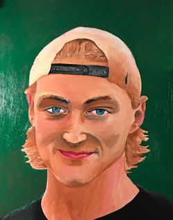
The painting on the right is using just the palette knife with oil paint and the painting on the left is just with regular brushes. This was my first time ever using oil paint so it wasn't the best. But i learned a lot from it and i have gotten better with practice.
|
|
|
|
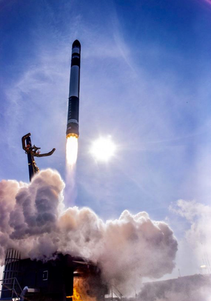
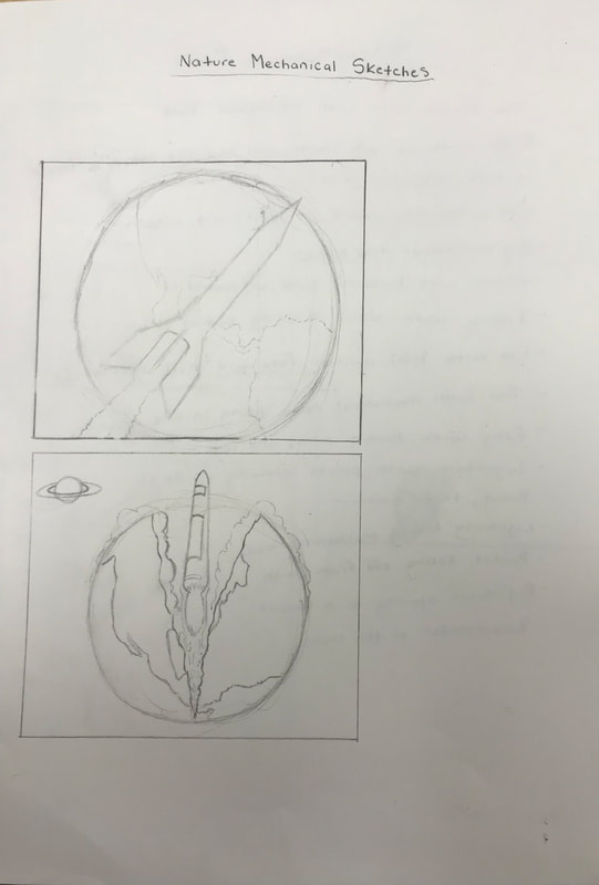
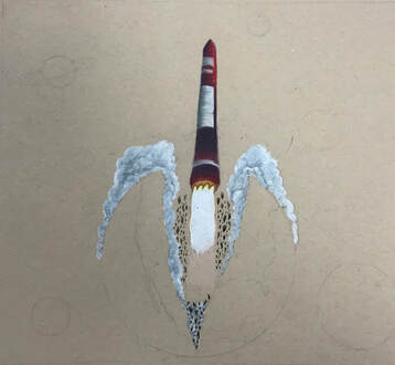
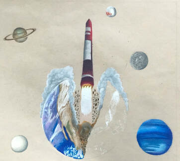
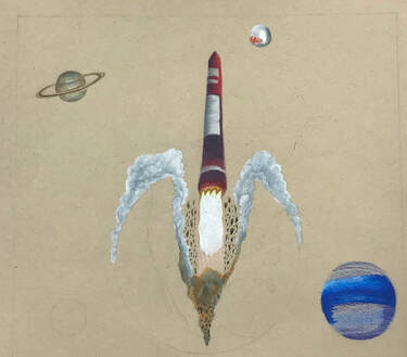
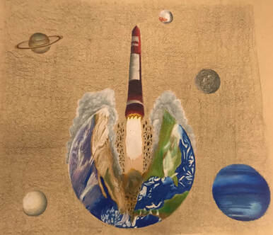
For this Nature Mechanical Project I drew a picture of a rocket ship emerging from the earth. I thought this would be a cool idea making the rocket way bigger in proportion to the world. I think that I did a good job creating detail with the earth and all of the clouds hovering over it. My favorite part of this piece was drawing the smoke clouds that come from the rocket taking off. The way i blended them and created value actually made a pretty realistic texture. I could have had a much better background and i will probably work on that to really make the piece pop. This drawing shows how much i have learned with prisma colors and has really increased my skills with this medium. I've learned more techniques to blend colored pencil and to create lots of value.
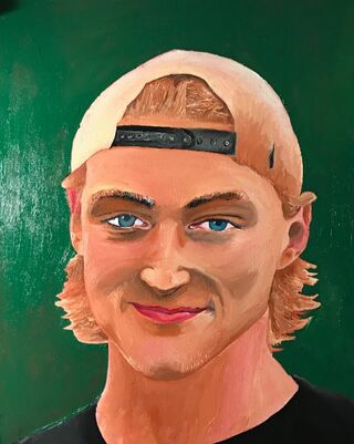
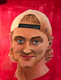
My self portrait piece was my favorite out of most of my pieces so far. It isn't the best looking piece but it is my favorite because it is the first oil painting that i have ever done and i am pretty proud of it. I wasn't sure what i was walking into when starting this piece because i have never painted a portrait in general, let alone with oil paint. I was really surprised on how well the oil paint blends compared to acrylic. It is very good at blending colors together but takes forever to dry and gets all over. I was against oil paint before i painted this portrait because i had never used it before. But after painting an entire self portrait with it, I'd have to save that i favor oil over acrylic now. I enjoy the way it blends and how realistic i can make pieces with it.
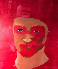
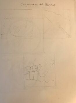
This is my reflection piece that I did at the beginning of the class. It is my least favorite piece because the detail and values in it is just terrible. I should have added way more layers and a lot of small details. To me this piece just looks so plain and blurry. This project has helped me for many of my future prisma color projects and I have learned many more techniques and what to do different. My most recent prisma color drawing looks much better and really shows my progress with this medium.
|
|
|
|
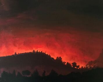
This painting I did was of the forest fires that happened back home in northern California where I used to live. This topic was was special to me because I know a lot of friends that have lost their homes and family that are struggling right now because of the aftermath. That is why this piece means so much to me. My family is all good now and this painting reminds me to stay strong no matter how harsh it may get sometimes. It was done in acrylic paint.
Concentration #2
|
|
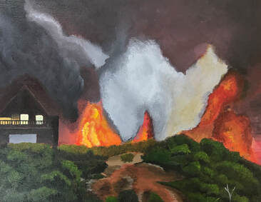
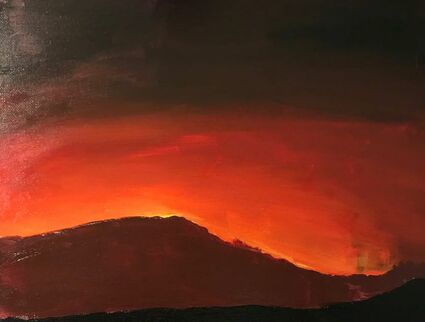
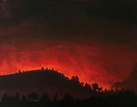
This acrylic landscape painting is probably the most realistic fire painting in my concentration. I really wanted to emphasize how the fires are just taking over the entire landscape and slowly consuming the land. This is one of the more darker pieces that expresses the tragedy of the fires. I started this painting out by creating all of the smoke and most of the fire. The background is always the hardest part for me when creating landscape paintings. Once I get over that hump the painting really starts coming together. The grass field and trees makes this piece whole, the cabin with the bright light also brings a little more humanity to the piece.
Concentration #3
|
|
|
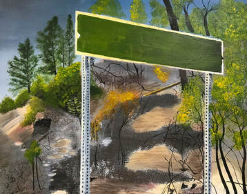
|
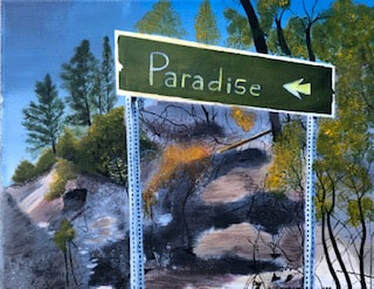
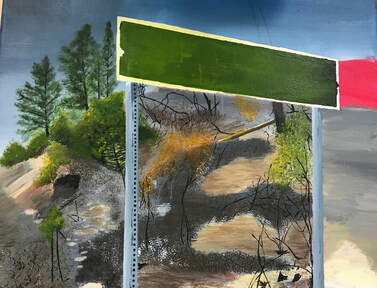
I am very proud of this painting, especially how the trees and bushes turned out. Paradise is a town in northern California that was hit extremely bad by the fires. So that is why I wanted to put paradise on the sign to kind of show that there is still hope and that we will recover. I wanted this painting to be more uplifting so I tried to use the most vibrant and bright colors I could in the trees. The hardest part was creating the illusion of the hill because the sign was standing at the bottom of it and all of the bushes and trees were slanted on the hill. I think that I did a pretty good job with it but if I could fix anything I would definitely add more values and shadows. I would also try to nail the illusion of the hill a bit more.
Concentration #4
This peanuts painting probably has the most symbolic value to me out of all of my concentration pieces that I created. I put Woodstock in there because the hometown that I used to live in (Santa Rosa) was home of the creator of the Peanuts, Charles Schulz. This town was affected deeply by the fires and throughout the town there are statues of different Peanuts characters scattered, so I thought it would be a good idea to add one in this piece. The hardest part for me in this painting was the background of the smoke and fire (just like most of my other pieces). The bridge wasn't very difficult but I think that I definitely could have added more value and detail to the road.
Concentration #5
This is my peaceful landscape. I wanted to have a peaceful landscape because the fires were such a tragic event and I don't want my entire concentration to be focused on the negative side of the fires. I definitely could have added a lot more detail to the bushes and grass fields. I think that the clouds came out pretty good and decently realistic. I also used a new technique for the snowy mounts in the back of the painting. I used a pallet knife to scrape the white paint down to create a rocky, mountain type texture. I would like to re paint this picture in the future and fix the mistakes that I had the first time through.
Concentration #6
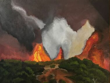
This is a small landscape painting I created of the Malibu fires. I didn't have a beach or water in any of my other painting so I thought that this would be a good idea for one of my last pieces. I don't have much experience with water in my painting but I honestly think that I nailed the waves and the color of the water. I also really liked how the mountains turned out. I used a very small brush and spent a lot of time to try and get all of the details right. The part of this piece that kind of bugs me is the smoky clouds, I feel like the colors are too vibrant and that I should have used a lot more of darker toned colors for them to make it look more realistic.
Concentration #7-12
These pieces are all ones that I have already done but submitted as six more pieces to my portfolio to show off the technicality of my painting skills. I zoomed in on the parts of the pieces that I feel like I included the most detail in and were probably the most difficult to create. The solo cups we probably the hardest for me because I had to create that illusion that there was a plastic bag in front of the cups and I had to include how scrunched up it was. It was also a challenge to paint all of the individual trees in the forest fire painting. I had to use a ruler and the smallest brush that I could find.
Final Reflection
I have grown a significant amount this year just from creating my entire concentration. I was stuck for a long time when I was trying to come up for a topic for this until I talked to my family about the fires and it just clicked. I didn't want my concentration to just be sad because it was a tragic fire so I mixed in a bunch of different types of pieces that have a deeper meaning and give hope to the people who were affected. I made my whole concentration acrylic paintings because painting has always been my weakness and I am so fascinated by painting so I wanted to really get good at it and improve and by doing this concentration I would say that I have improved a lot on my painting skills and techniques. I still have a long way to go but this class and the projects I did in it have taught me a lot and really developed me as an artist.
